The science behind colours ‘losing warmth’ on cloudy days
Introduction
The warm-cold colour difference is a whole different breed of science itself with a lot more into it than first meet the eye. Its significance is extremely high in skin-tone matching, as misalignment on warm or cold undertones can lead to a completely unsuitable palette. When doing digital analysis for a personal colour palette, having a photo made under clear, natural daylight is a core requirement, because what lower lightening does is altering the warm-cold feature of the colours.
The phenomenon is well known to science as Purkinje shift , where our eyes become more sensitive to blue light in low-light conditions. This shift plays a crucial role in night vision, significantly altering how we perceive colours when the light levels drop, and as such part of the night adaption strategy.
While in bright conditions, our eyes are more attuned to yellow-green wavelengths, as darkness sets in, dark adaptation kicks in, leading to an increased sensitivity to shorter wavelengths, primarily blueish colours. This colour shift is not just a quirk of human vision; it has profound implications for our ability to navigate and perceive our environment in low-light situations.
Dark Adaptation Process
Dark adaptation: is crucial for navigating after dark. It involves the transition in the use of the two types of photoreceptors in the eye, going from cone-dominated to rod-dominated vision as light diminishes. Cones primarily handle colour vision and function best in bright light, while rods are more sensitive to low light but do not detect colour. This shift plays a crucial role in enhancing our ability to see in the dark.
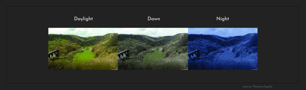
Dim lighting, varying from cloudy days to poorly lit aisles, is a transitional phase between the cone-dominated and rod-dominated states. Resulting in certain colours appears more muted along with increasingly blueish. When complete dark adaptation takes place, from around twilight (when the sun no longer contributes to the illumination), rods take over the work to adjust our eyes by increasing their sensitivity to the available light.
This intricate balance between rods and cones allows humans to see across a broad range of lighting conditions. The process of dark adaptation itself is a fascinating subject that has been explored in depth in various scientific studies, including one which can be found on PubMed.
Why Reds Look Darker Than Blues in Low Light, while yellow almost disappears
The contrast between colours also changes with light conditions. While yellow-green shades stand out in daylight due to cone activity, they lose their vibrancy in low-light settings where blue hues prevail. Understanding these shifts in colour perception helps explain why certain colours may be less visible or appear different in evening setups, such as nighttime driving or navigating dimly lit areas. This means yellow letters in a decorative rainbow text will become practically invisible for the evening guest.
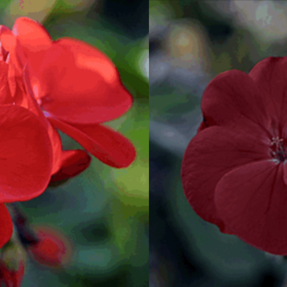
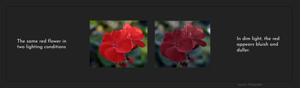
Dim lightening also reduces the vibrancy for most colours, and especially impacting our ability to distinguish reds. In low-light situations, our eyes’ cones (responsible for colour vision) become less active. Instead, the rods take over, and they are more sensitive to shorter wavelengths like blue and greens. This shift causes reds to appear darker than blues when there’s not much light.
Design considerations for lighting in public spaces and homes often incorporate the effects of the Purkinje shift. Urban planners and architects optimize illumination by using blue-hued lights in pathways and hallways, which align with our natural night vision tendencies. This design strategy ensures safer and more comfortable navigation during nighttime, as outlined in these lighting design guidelines.
Safety measures related to visibility and colour perception at night are essential. For instance, emergency exit signs often use blue or green lights due to their enhanced visibility under low-light conditions. Additionally, vehicle dashboard lights and streetlights designed with a focus on blueish colours improve driver response times and reduce accidents. Street lighting design also plays a significant role in pedestrian safety during nighttime.
Conclusion: prepare for the blue-hued world of cloudy days
The importance of the Purkinje shift goes beyond scientific interest and has practical implications for our daily lives. This phenomenon, related to adapting to darkness and changes in colour perception as light diminishes, highlights how flexible our visual system is. It also provides a constant challenge to define what is warm and what is a cold colour as the answer strongly depends on the lightening under which we examine them. During personal colour analysis, the Huedentity system uses several different digital strategies to adjust the colours toward the ideal bright daylight setup. The process is delicate and has its limits, which makes it essential to receive a close to ideal photo for the analysis. As bright lighting enhances colour vibrancy and allows for a fuller spectrum of colours to be perceived.
In contrast, dim lighting can cause certain colours, especially reds, to appear darker than blues due to changes in visual sensitivity and how colours are processed by our eyes. Colours that are typically vibrant during the day, like yellow-green, also appear muted or different, changing the visual scene we experience.