The
client
Objective
With decades of experience in helping elementary school students excel in math exams, the client felt that her growing online presence could greatly benefit from a recognisable visual frame.
To develop her distinct visual identity, a guideline has been created with a personal touch that mirrors her nature and thoughtful approach as a coach.

Essential Package
Content
- The skin-tone matching results, presented as a color chart and a graphic artwork to highlight the natural palette.
- The color theme that is designed to bridge the gap between personal palettes, and industry color trends.
- A pop-art avatar for digital profiles.
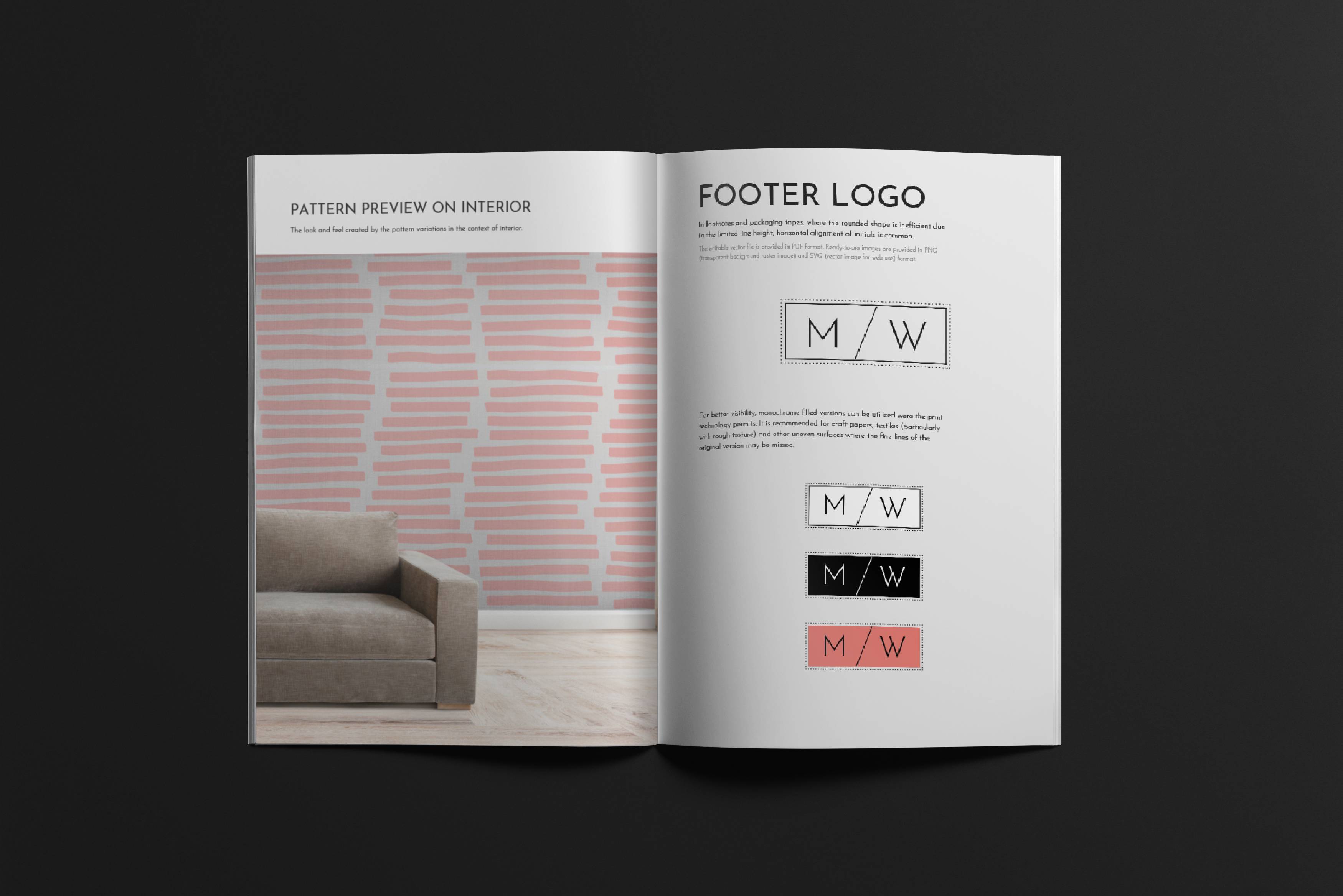
- A seamless pattern for interior and print design.
- A font logo created in stamp and rectangular format to be used for letterhead or footer on documents.
- A set of social profile images that includes page banner and sample posts.
- A business card design in two color options that are ready for printing.
- Step 1. Client vision
- We start by sending a comprehensive questionnaire that delves into the client’s perception of beauty and their specific business goals that they aim to achieve through branding. This step is crucial in gaining a deeper understanding of the client’s perspective and expectations, and helps us tailor the branding approach to resonate with the client’s ideal self-representation. To perform color analysis, we also contact the client to obtain a few selfies from them that were made in well-lit but not overexposed natural light. Upon receiving the details one of our senior color harmony specialist will dive into the analysis and will contact the client with the first results.
- Step 2. Color analysis
- The client’s natural coloring is assessed thoroughly during a color analysis to determine the most resonant colors for them. Our skin-tone matching method utilizes the Human Centered Color System®, an innovative method that adheres to scientific definitions of color dimensions, rather than relying on personal perception based on warmth-cold distinction. Instead of seasonal clustering, it employs a highly personalized color palette creation method. As a result, an exclusive palette is created that explains the matches in their context of the client and color domains. The client receives the result both in a practical format and through graphic art to honour their individuality.
- Step 3. Palette formation
- A harmonious color palette is selected from the broad palette that is found to be aligned with the client’s natural tones. In order to achieve visual clarity, 2-3 principal colors are selected that can bridge the client’s color palette and the industry’s color trends. By using swatches, they are expanded into a cohesive palette and applied throughout the upcoming brand elements. To guarantee alignment, we present the proposed principal colors to the client before moving forward, as it’s crucial to verify emotional compatibility.
- Step 4. Brand essentials
- The foundational elements of the brand are carefully crafted in this stage to ensure that it represents the client’s identity cohesively. We develop a distinct visual language that includes a brand pattern, font style, and abstract graphic design elements that embody the brand’s essence and will be used for asset creation. These assets, as included in the essential package are font logos, a social media set, digital wallpapers, and a print-ready business card.
My branding package is fantastic, it’s friendly and delightful. After updating my profile, my students sent me messages about the warm vibe and kind look and feel. This was my goal, because math is somewhat scary for most students, so I wanted to bring a bit of a heart to my coaching to connect better with them. This image gives me the feeling of starting a new phase in my career, which makes me so excited.
– Maria Weber, Math Coach


